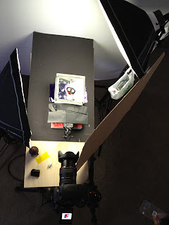
I wanted to add a collection of BTS shots taken with my iPhone 4s to demonstrat what my real-life studio setup looked like. I didn't manage to take a snapshot of every setup (durrr) but the ones i can show on here will hopefully be enough.
Andrew Morgan - Workshop 2 (Studio)
Lecturer: Julian Steveson Objective: The use of camera equipment in a studio.
Sunday, 28 October 2012
Product Photography - Take 4 (examples).
(25-10-2012)
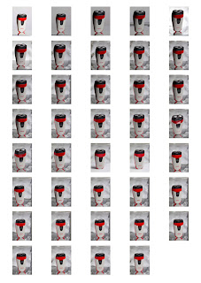
Okay, so here is a proof-sheet to give a visual example of the sort of things i tried during the shoot to demonstrate how i approached my lighting and positioning of each product in order to try bring out its best and in doing so, combine these elements to create a very usable image..
The image below the proof-sheet is a lighting diagram, behind the scenes snapshot and then finally what i chose as "the shot" and has since been tweeked and refined, ready to submit.
Hope you like it,
D.
 |
| © dphotografic.com |
Next are a few screen-grabs of the editing done to each of the chosen images with an original and edited version of each on display within the Photoshop interface.
 |
| ORIGINAL IMAGE © dphotografic.com |
 |
| EDITED IMAGE © dphotografic.com |
- INSERT LIGHTING DIAGRAM HERE -
Product Photography -Take 3 (examples).
(24-10-2012)
Okay, so here is a proof-sheet to give a visual example of the sort of things i tried during the shoot to demonstrate how i approached my lighting and positioning of each product in order to try bring out its best and in doing so, combine these elements to create a very usable image..
The image below the proof-sheet is a lighting diagram, behind the scenes snapshot and then finally what i chose as "the shot" and has since been tweeked and refined, ready to submit.
Hope you like it,
D.
Next are a few screen-grabs of the editing done to each of the chosen images with an original and edited version of the image on display within the Photoshop interface.
Okay, so here is a proof-sheet to give a visual example of the sort of things i tried during the shoot to demonstrate how i approached my lighting and positioning of each product in order to try bring out its best and in doing so, combine these elements to create a very usable image..
The image below the proof-sheet is a lighting diagram, behind the scenes snapshot and then finally what i chose as "the shot" and has since been tweeked and refined, ready to submit.
Hope you like it,
D.
 |
| © dphotografic.com |
Next are a few screen-grabs of the editing done to each of the chosen images with an original and edited version of the image on display within the Photoshop interface.
 |
| ORIGINAL IMAGE © dphotografic.com |
 |
| EDITED IMAGE © dphotografic.com |
- INSERT LIGHTING DIAGRAM HERE -
Saturday, 27 October 2012
Product Photography - Take 1 (examples).
(15-10-2012)
Okay, so here is a proof-sheet to give a visual example of the sort of things i tried during the shoot to demonstrate how i approached my lighting and positioning of each product in order to try bring out its best and in doing so, combine these elements to create a usable image..
This shoot was aimed to produce "the shot" which could then be used to deep-etch the product cleanly from the background in order to then be dropped into (added) to the following photograph of a human subject and then finally add some text to complete a usable advertisement.
I feel it all worked out nicely.
D.
 |
| © dphotografic.com |
 |
| This is the original photograph. |
 |
| This is the deep-etched result. A customised selection has been create and saved so that the product can be selected and dragged onto another photoshop file at any time. |
- INSERT LIGHTING DIAGRAM HERE -
Product Photography - Take 2 (examples).
(19-10-2012)
Okay, so here are 3 proof-sheets to give a visual example of the sort of things i tried during the shoot to demonstrate how i approached my lighting and positioning of each product in order to try bring out its best and in doing so, combine these elements to create a very usable image..
The images below the proof-sheets are what i chose as "the shot" and both have since been tweeked and refined, ready to submit.
Hope you like it,
D.
Next are a few screen-grabs of the editing done to each of the chosen images with an original and edited version of the image on display within the Photoshop interface.
Okay, so here are 3 proof-sheets to give a visual example of the sort of things i tried during the shoot to demonstrate how i approached my lighting and positioning of each product in order to try bring out its best and in doing so, combine these elements to create a very usable image..
The images below the proof-sheets are what i chose as "the shot" and both have since been tweeked and refined, ready to submit.
Hope you like it,
D.
 |
| © dphotografic.com |
 |
| © dphotografic.com |
 |
| © dphotografic.com |
Next are a few screen-grabs of the editing done to each of the chosen images with an original and edited version of the image on display within the Photoshop interface.
 |
| ORIGINAL IMAGE © dphotografic.com |
 |
| EDITED IMAGE © dphotografic.com |
- INSERT LIGHTING DIAGRAM HERE -
 |
| ORIGINAL IMAGE © dphotografic.com |
 |
| EDITED IMAGE © dphotografic.com |
- INSERT LIGHTING DIAGRAM HERE -
Wednesday, 17 October 2012
TEST-SHOOT for coloured background.
Okay so i just took a few test-shots at home, with a few bits-n-pieces of my photographic equipment and light-modifiers, of a possible concept i came up with yesterday .
So i have borrowed a glass-brick from the studio with the hope it would be an interesting way of breaking-up / diffusing some coloured light produced from a combination of my speedlite and some coloured gels and project this effect onto a large sheet of styrofoam in order to create a groovy looking background.
I sent off an email to Julian to check if this is acceptable, to which he has replied positively, which is great, because that means i can now start photographing everything without the fear of wasting time and energy on it all :]
A lighting diagram for all this would be difficult to create and understand, so i have included two snapshots from the iPhone as a visual reference for you to "get" what i mean and see how it was done - for now. I will refine everything tomorrow.
Take a look.
D.
 |
| The result of my test-shot. I now need to build up some lighting on the product and get it looking right so the product stands out from the background. |
 |
| Same as above, but from behind the camera instead of a side-on view. (obviously) |
Products and props.
Okay so here is a close-up of the products i have acquired for this assignment and the prop i want to experiment with (and hopefully use) to help give a consistent look-n-feel to the overall result.
Yesterday i approached a CIT student with the right "look" that i am after for this shoot (see below portrait) of which i will then use as a face-filled background to support the product/s and he is now locked in for next Monday. He has the trimmed beard - I may also source a smoothly shaven face and shoot that as a backup in case the other doesn't come together so well.
I should be able to spend time on this either tonight, tomorrow or Friday. Hopefully things come together like how i am envisaging it right now.
D.
 | |
| The sort of effect i hope will result from combining the glass brick, a blue gel and some back lighting. WILL LOOK GOOD IF IT WORKS :] |
 | ||
| The glass brick i have on-lend from CIT to experiment with for this assignment. |
 |
| The sort of bearded look my subject has. |
Subscribe to:
Comments (Atom)


